How It's Made
Bringing Instacart Pickup to life
Designing a new product and shopping experience from the ground up.
Contributors: Senior Product Designers Andressa Bougleux and Dan Shilov
Why pickup makes sense
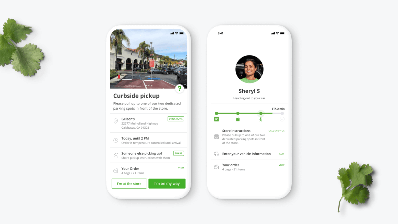
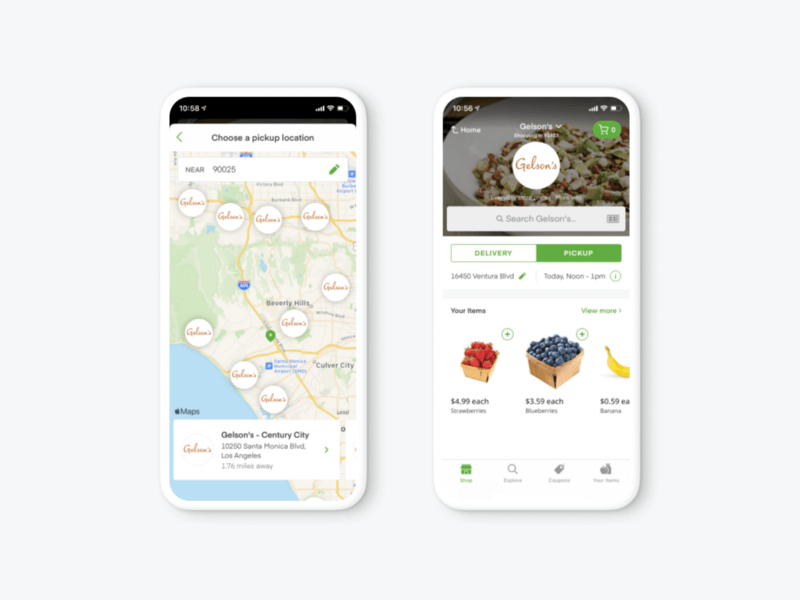
Imagine: It’s late in the afternoon when Carol realizes she forgot to buy fish for Taco Tuesday dinner with her kids. She’s still at work, so she opens the Instacart app, finds the ingredients she needs, and schedules a pickup order at a store that’s on the way home.
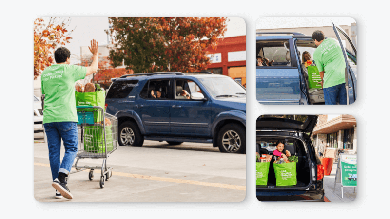
Carol hasn’t been to this store but the in-app pickup instructions (with detailed photos) show her that she should park at the front of the store. The timing couldn’t be more perfect — just as she pulls up, a store associate greets her and helps her load the groceries.
The challenge of pickup
For years, Instacart has been known as a convenient grocery delivery service, available to more than 85% of US households. Designing the new pickup experience meant stepping outside of our core delivery flows and taking into consideration a new set of challenges that didn’t exist with delivery.
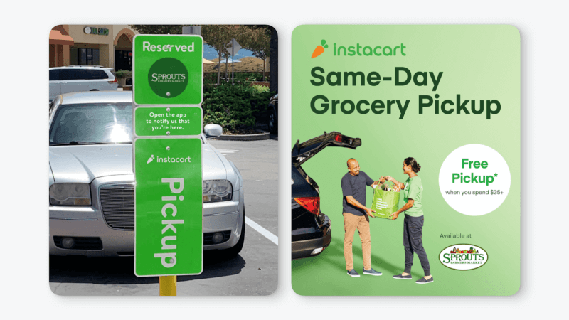
This is where designing a product collides with the logistics of the real world. When picking up an order, the customer needs to find the right place to park, but each store has a different set up — some have dedicated pickup parking spots, and others have a curbside pickup lane. Sometimes the parking spots are taken — and sometimes the instruction signs are unclear or hard to find.
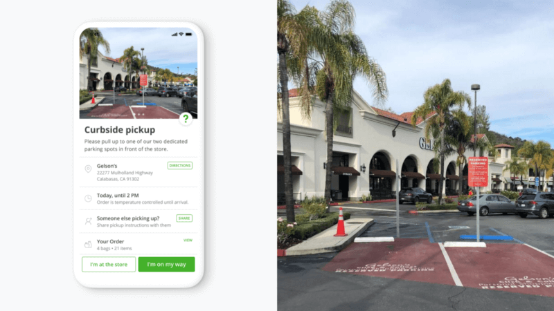
These constraints make it harder for a store associate (or shopper) to confidently find the customer, so the more challenges like these that we can foresee and design for, the less time customers will have to wait, if at all.
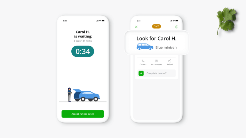
This journey presents many steps and it’s critical to orchestrate them together to achieve a seamless experience that quietly fades into the background.
Understanding the new landscape
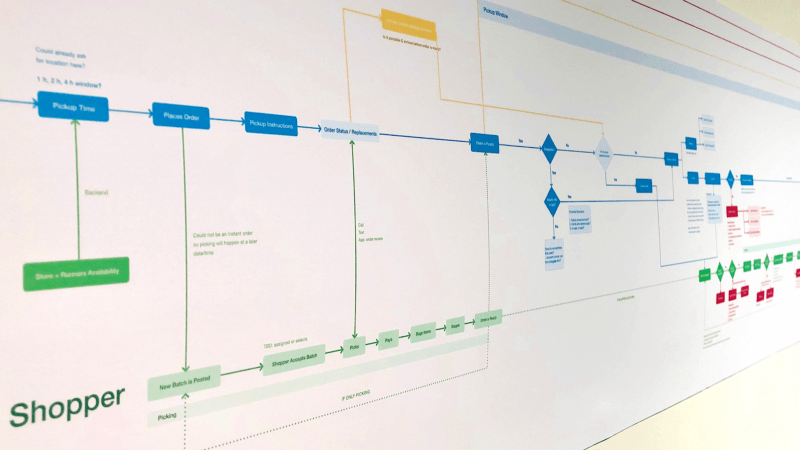
To get better alignment through the steps of this new experience, we mapped out the entire shopper and customer journeys from the moment the order starts being shopped, to the moment the customer is picking it up at the store. We took into consideration not only the digital interactions, but also the real world steps.
This helped us understand the gaps in our existing flows and identify touchpoints with higher risks of unhappy paths in the experience that we should be solving for.
Designing collaboratively
By analyzing these high-risk touchpoints in the shopper-customer journey map, it became clear that the most challenging part of the experience was solving for wayfinding at the grocery store, as it would be key to guide both shoppers and customers towards a smooth interaction.
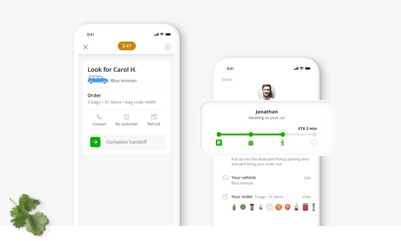
From our studies with the research team, we learned that customers have certain expectations on how long they’re willing to wait for their order. So we quickly identified that shoppers and customers needed clear guidance for a seamless experience:
- Set expectations with context: Images of the store pickup area are used in the customer app to provide clear visual guidance about where they have to park when they arrive and what to expect next.
- Less is more: To make the process seamless for shoppers, we simplified their workflow to focus only on the task at hand (such as finding the customer’s bags), while deferring information about the customer’s location and car to when they arrive.
As our flows started to take shape, we ran several rounds of concept testing, iterating on the design and copy to ensure the right amount of info is communicated at the right time.
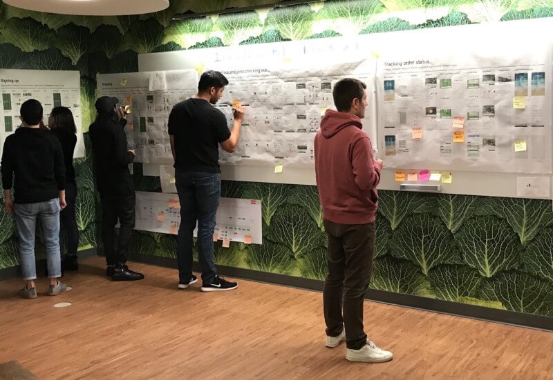
Since pickup spans many different touchpoints through the whole Instacart customer experience — storefront, checkout, post-order, and so on — syncing with the larger design team was also key to understand how their features impacted the design process.
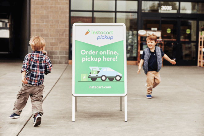
As we designed the shopper and customer flows, as well as signage for pickup areas and promotional assets, close collaboration between the shopper and consumer product designers, brand designers, and researchers working on the pickup experience gave us a shared understanding of our users and stakeholders, and opportunity to review each other’s work during our weekly design syncs.
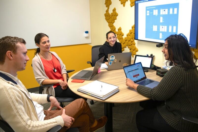
Launching and learning
Testing the mobile web and app experiences ourselves at an actual grocery store helped us understand some of the physical world challenges that are often glossed over in the digital world. This helped us understand the impact of weak mobile signals, weather, and proper pickup signage positioning.

Our research didn’t stop once we launched v1 nationwide. To understand the ground truth that shoppers and customers experience during pickup, we went out to the field again. To get the full context, we visited several retailers in different regions.
“I really loved that the store employee called me by my first name and chatted with me while she loaded my groceries. It was like I was visiting with a friend, and it made me feel like she really cared about my experience.”
— Instacart Pickup customer
We conducted in-person interviews, observations, and shadowing sessions. This was a cross-functional effort, spanning product design, brand, research, product, business development, and field operations.
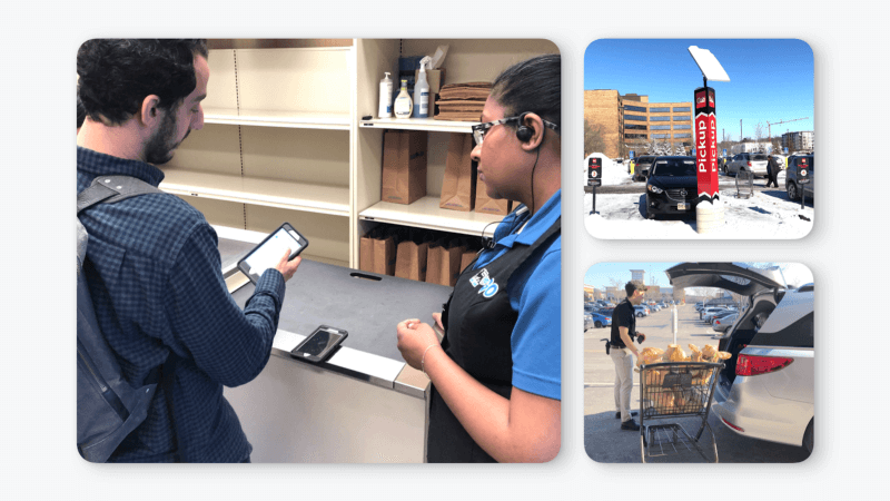
The insights collected helped us not only improve the in-app experience but also create best practices for pickup signage for our retail partners, ensuring that customers have a consistent and clear experience both physically and digitally.
So what’s next for pickup?
At Instacart, we’re always working to make shopping easier for everyone, so we’re excited to continue learning and improving the pickup experience for both customers and shoppers.
Come build with Andressa and Dan.
If you’re excited about defining the future of a one trillion dollar industry, building an ad-serving network for groceries, scaling the world’s most extensive grocery catalog, perfecting a real-time on-demand logistics chain, all while simultaneously designing the future of food for millions of people, you should take a look at the available opportunities or reach out to someone from the team.
Interested in learning more about Design at Instacart? Head over to our Design blog.
Most Recent in How It's Made
How It's Made
One Model to Serve Them All: How Instacart deployed a single Deep Learning pCTR model for multiple surfaces with improved operations and performance along the way
Authors: Cheng Jia, Peng Qi, Joseph Haraldson, Adway Dhillon, Qiao Jiang, Sharath Rao Introduction Instacart Ads and Ranking Models At Instacart Ads, our focus lies in delivering the utmost relevance in advertisements to our customers, facilitating novel product discovery and enhancing…
Dec 19, 2023
How It's Made
Monte Carlo, Puppetry and Laughter: The Unexpected Joys of Prompt Engineering
Author: Ben Bader The universe of the current Large Language Models (LLMs) engineering is electrifying, to say the least. The industry has been on fire with change since the launch of ChatGPT in November of…
Dec 19, 2023
How It's Made
Unveiling the Core of Instacart’s Griffin 2.0: A Deep Dive into the Machine Learning Training Platform
Authors: Han Li, Sahil Khanna, Jocelyn De La Rosa, Moping Dou, Sharad Gupta, Chenyang Yu and Rajpal Paryani Background About a year ago, we introduced the first version of Griffin, Instacart’s first ML Platform, detailing its development and support for end-to-end ML in…
Nov 22, 2023

 Building Instacart Meals