How It's Made
Building a Better way to Help Shoppers
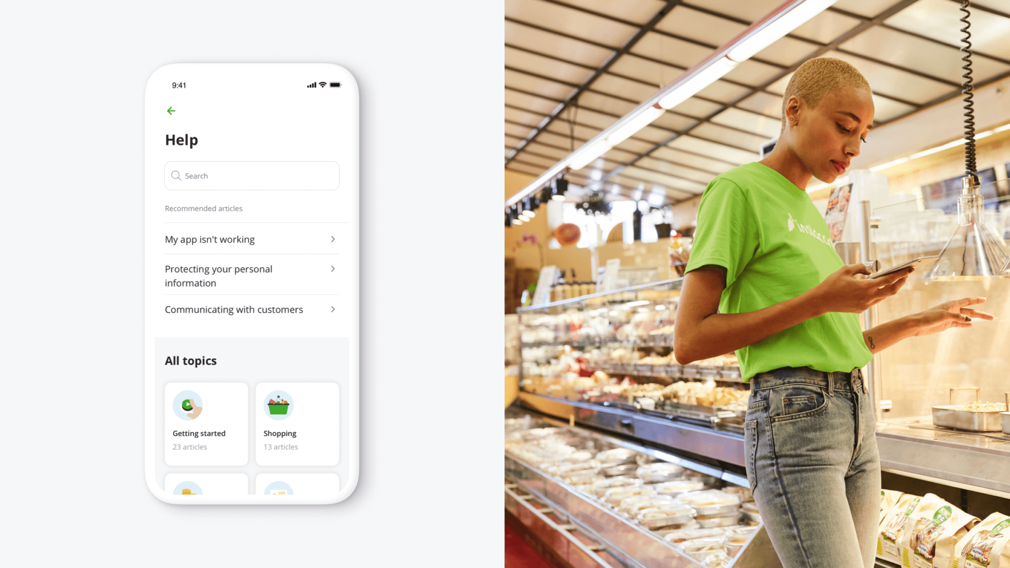
Overview
Grocery shopping seems like a relatively straightforward task — when it’s for yourself. When you shop for others, there are a lot of variables that can make the experience more complex. As someone begins to shop, they often have some common questions: How do I pick quality produce? How do I choose the right replacement? What do I do when customer isn’t at home to receive their order?
At Instacart, we’re working on designing solutions for a seamless help system so shoppers can easily troubleshoot in confusing situations or chat with a person who can support them anytime.
Challenge
A year ago, if a shopper contacted Instacart to get help, our team didn’t have a lot of visibility into the issue they were contacting us about. When Care agents took shoppers’ calls, they had to ask a lot of questions to understand what problems they were experiencing, which led to long call times.
If shoppers wanted to read information about how things work in the Shopper app, they had to access a web-only Help Center. Switching between the Shopper app and the web (especially in cases where connectivity might be an issue) wasn’t an ideal experience — especially when shoppers were in the middle of an order.
We saw an opportunity to improve what we call the help experience: The flow of how a shopper gets useful, relevant information when they have a question while shopping an order. This was clearly a big project, and it was going to involve a lot of cross-functional partners, which added to the complexity. But challenging problems are what makes things exciting for us.
Goals
To kickstart the project, we got together with cross-functional members of the team and brainstormed about the future of help. This helped us to align on the vision and make sure that everyone was moving in the same direction.

We aimed to create a simple, dynamic experience for shoppers that offers different options for getting support. To get there we planned to hit a few goals:
- Learn as much information about shoppers and their issues as possible
- Create a more flexible way of contacting Care by enabling chat functionality
- Create mobile-friendly content and rewrite articles in an easily scannable format
- Offer shoppers a customized set of articles based on their status and location in the app
- Make access to help consistent and easily discoverable
How we built it
Enabling our Instacart Care team
First, we needed to collect as much data as possible to understand what was happening in the Shopper app when shoppers experienced an issue.
This was made possible by enabling chat and call functionality right from the app, instead of having a shopper dial a phone number. With this method, we could see when and where shoppers were most likely to reach out for help. This helped us identify the highest friction points and share this new info with our agents, who could then help shoppers find solutions faster.
Mobile first
Meanwhile, in collaboration with our content team, we optimized help articles for mobile. We decided to format them in snippets of information, so shoppers could read and navigate through information faster. Additionally, we held focus groups with shoppers, and used card-sorting methods to understand how shoppers think about different categories of articles, giving us the chance to organize the articles in a way that best reflects the on-the-ground shopping experience.
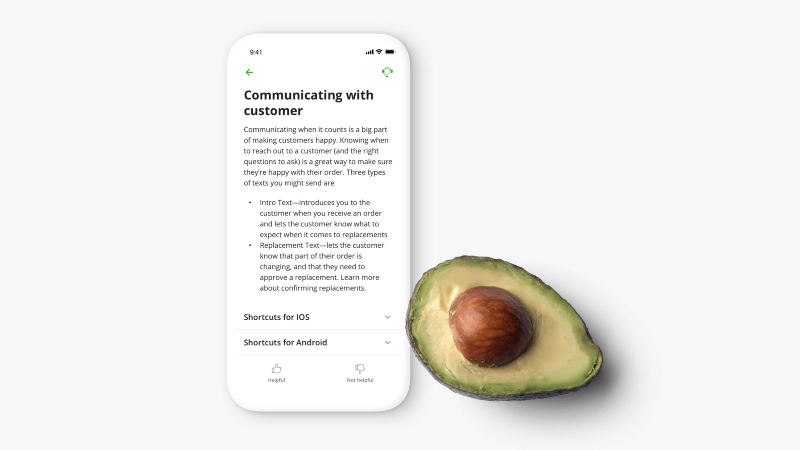
So at this point, we had more data about shopper issues and some new resources to answer their questions, but we knew we had to think more about contextual problem solving.
A smarter experience in the moment
Imagine that a shopper is looking at their customer rating in the app and has a question. It’s natural to want to reach out to someone when it comes to something like a rating, but what if we showed them a few relevant articles as they landed on their rating screen? This way they might not need to contact support after all.
To enable smart article recommendations, we needed to add access points to help on every page. So we made help resources easily discoverable with a new, global access point in the top-right corner.
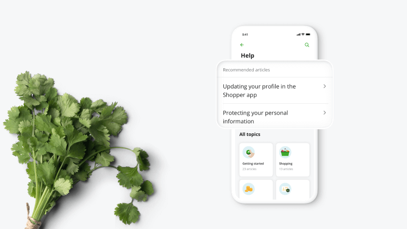
Eventually, we added all categories of articles to the help page and enabled its full potential. To get here, we conducted a few concept tests with shoppers to make sure it was clear on how to get help. Shopper feedback indicated we were on the right track.
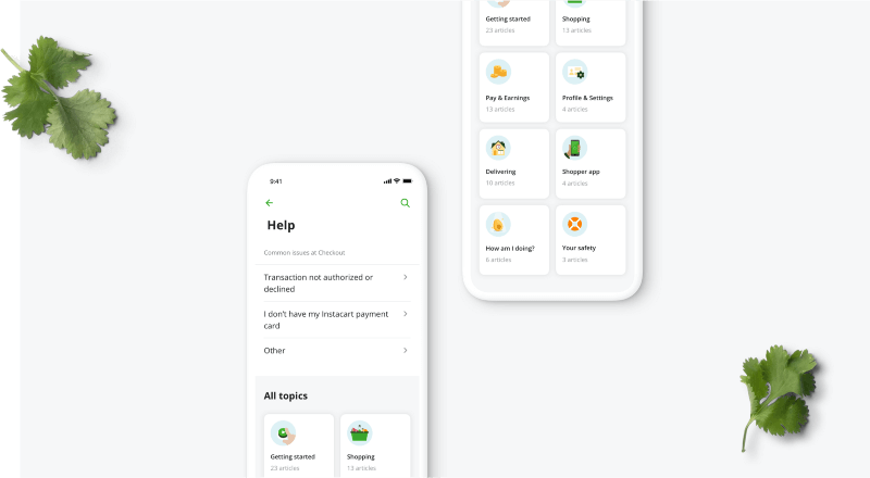
Making help accessible
Having access to help and support on every page of the app gave us a lot of insights into possible opportunities where we could improve a shopper’s experience. Now every team in our organization uses high-level insights on how to make the experience better while saving time, money, and resources on support.
Results
Having all the articles right inside the app allows shoppers to get the help they need without necessarily having to contact Care. In the previous web-based Help Center, shoppers searched for articles much more frequently, but with smart article recommendations we were able to reduce the friction that searching can cause.
We now receive feedback about articles from shoppers — they can upvote or downvote an article and it creates another stream of feedback that lets us know if we need to revisit articles and make them clearer.
Another great result was the alignment of the whole organization on how we think about help. We now know how many resources we spend on support coming from every page, which allows us to better prioritize our work. Most importantly, the new help flow allows us to understand where we can improve the product, which will have a huge impact on the way we think about our core experiences.
Come build with us.
If you’re excited about defining the future of a one trillion dollar industry, building an ad-serving network for groceries, scaling the world’s most extensive grocery catalog, perfecting a real-time on-demand logistics chain, all while simultaneously designing the future of food for millions of people, you should take a look at the available opportunities or reach out to someone from the team.
 Interested in learning more about Design at Instacart? Head over to our Design blog.
Most Recent in How It's Made
How It's Made
One Model to Serve Them All: How Instacart deployed a single Deep Learning pCTR model for multiple surfaces with improved operations and performance along the way
Authors: Cheng Jia, Peng Qi, Joseph Haraldson, Adway Dhillon, Qiao Jiang, Sharath Rao Introduction Instacart Ads and Ranking Models At Instacart Ads, our focus lies in delivering the utmost relevance in advertisements to our customers, facilitating novel product discovery and enhancing…
Dec 19, 2023
How It's Made
Monte Carlo, Puppetry and Laughter: The Unexpected Joys of Prompt Engineering
Author: Ben Bader The universe of the current Large Language Models (LLMs) engineering is electrifying, to say the least. The industry has been on fire with change since the launch of ChatGPT in November of…
Dec 19, 2023
How It's Made
Unveiling the Core of Instacart’s Griffin 2.0: A Deep Dive into the Machine Learning Training Platform
Authors: Han Li, Sahil Khanna, Jocelyn De La Rosa, Moping Dou, Sharad Gupta, Chenyang Yu and Rajpal Paryani Background About a year ago, we introduced the first version of Griffin, Instacart’s first ML Platform, detailing its development and support for end-to-end ML in…
Nov 22, 2023

 Building Instacart Meals
  Introducing Coil: Kotlin-first Image Loading on Android
  7 steps to get started with large-scale labeling
