Company Updates
Carrot Evolution: A New Brand Identity to Reflect a New Ambition
As Instacart’s business continues to grow and expand, it’s important that our brand identity reflects the company’s evolution. When we started Instacart a decade ago, we were just a grocery delivery company, and our main audience was consumers. Back then, we chose a carrot as our logo because it was a fun, friendly, and approachable image to represent the food we fill our grocery carts with. Fast forward to today, and our business looks a lot different. Over the years, we have evolved to be grocery-first but not grocery only. Today, we serve consumers and more than 750 retail partners and 5,000 CPG brands, and our shopper and employee community have grown exponentially. From fresh produce to home goods, beauty, pharmacy, electronics, office supplies, and hardware, we now serve more use cases, aisles and retail categories than ever before — helping consumers run their households, and enabling retailers and brands to succeed.

To reflect this new reality while honoring our past, we’ve evolved our brand identity to support a more modern, inspirational, and connected experience for our community. The refreshed visual identity will include a new logo, wordmark, typography, and color. And in the coming months, it will show up across all the touch points where the Instacart brand exists today.

From the beginning of the redesign process, we knew we would retain the carrot icon. We love its original spirit and how beloved it is by everyone in our community. But we wanted to reimagine the carrot in a bold and flexible way that matches our current offering and future ambitions. For inspiration, we looked to brand systems built around motion and transformation, as well as brands that have stood the test of time and have consistently captured the hearts and minds of their communities.
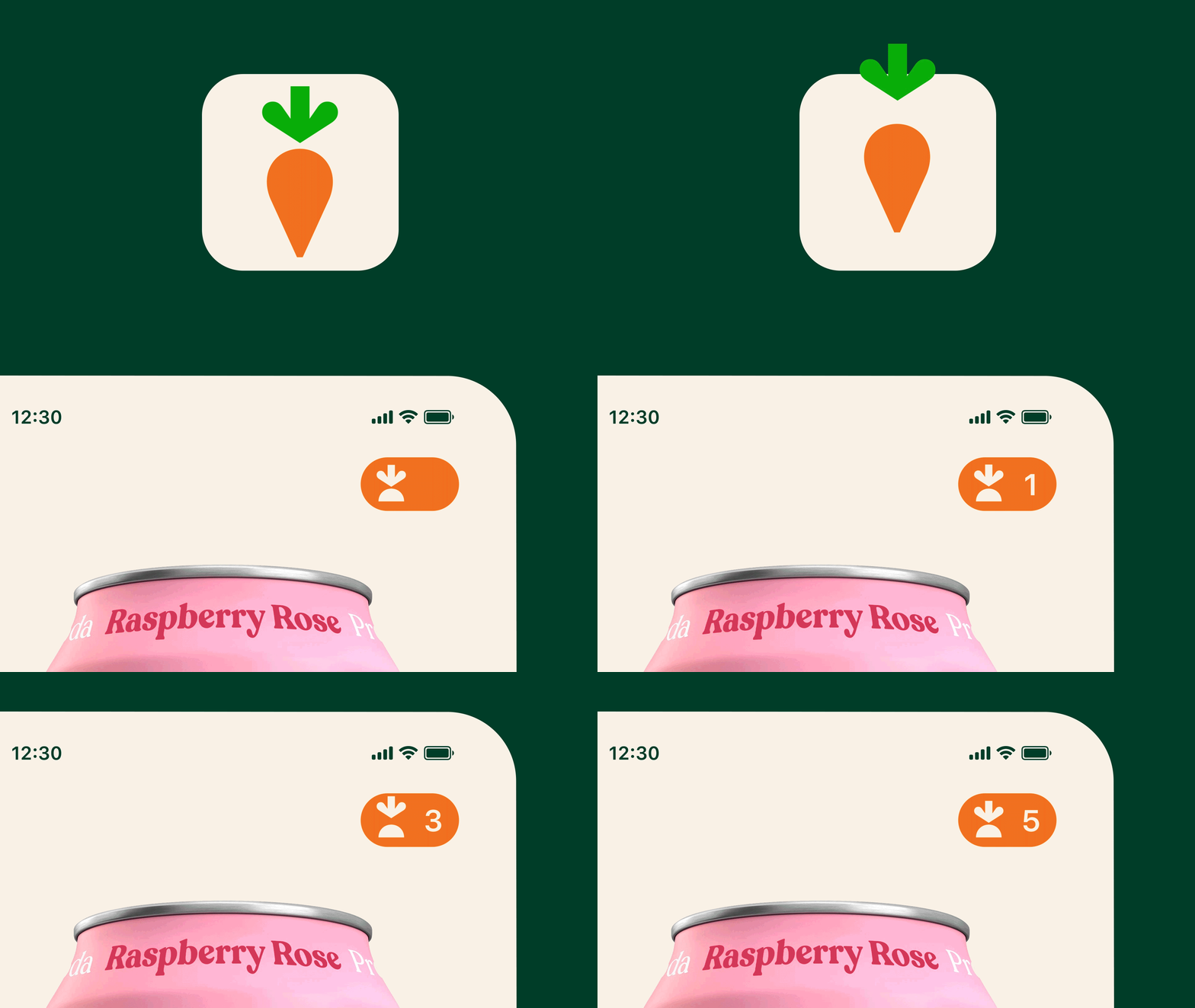
With this brand evolution, the original carrot icon has been reimagined into a flexible symbol representing two elements of Instacart’s value proposition: shop and savor. The carrot top represents “shop” and doubles as a clean-lined, efficient arrow symbolizing the ease of adding items to an Instacart cart. The arrow can also incorporate motion by pointing at and pulling up images, items, and shapes — communicating the range of our offering. On the other hand, the carrot root represents “savor” and symbolizes the enjoyment and nourishment powered by our offering — with the soft curves of the form evoking the enjoyment of savoring delicious food with loved ones. These principles were also applied to the wordmark design, which features a seamless blend of clean, efficient lines and soft, round geometry.
“While it was important to us to evolve and modernize the brand, it will also remain familiar,” said Laura Jones, Vice President and Head of Marketing at Instacart. “Our brand continues to feature the original carrot icon, but we’ve revamped it to capture the emotional spectrum of the evolving brand, to include features that enable us to spotlight new use cases that have become important to our customers such as home goods, beauty, electronics and more, and to highlight our retail partners and advertisers.”
We’ve also defined a modern and fresh new color palette grounded in food. From “Kale” green to “Turmeric” yellow to “Guava” pink, our new color family is a nod to our grocery roots while also being flexible enough to communicate our growing range of categories. Rounding out the system is typography that flexes across the spectrum of transactional to inspirational messaging — whether it’s a grocery order confirmation or craveable recipes.
Importantly, the refreshed brand allows us to speak thoughtfully and specifically to everyone in the Instacart community. From lifting up and spotlighting our valued retailer and CPG brand partners, to engaging with our shopper community, to delighting customers, to inspiring employees, our brand system is designed to flex and shift depending on who we’re speaking about or with.
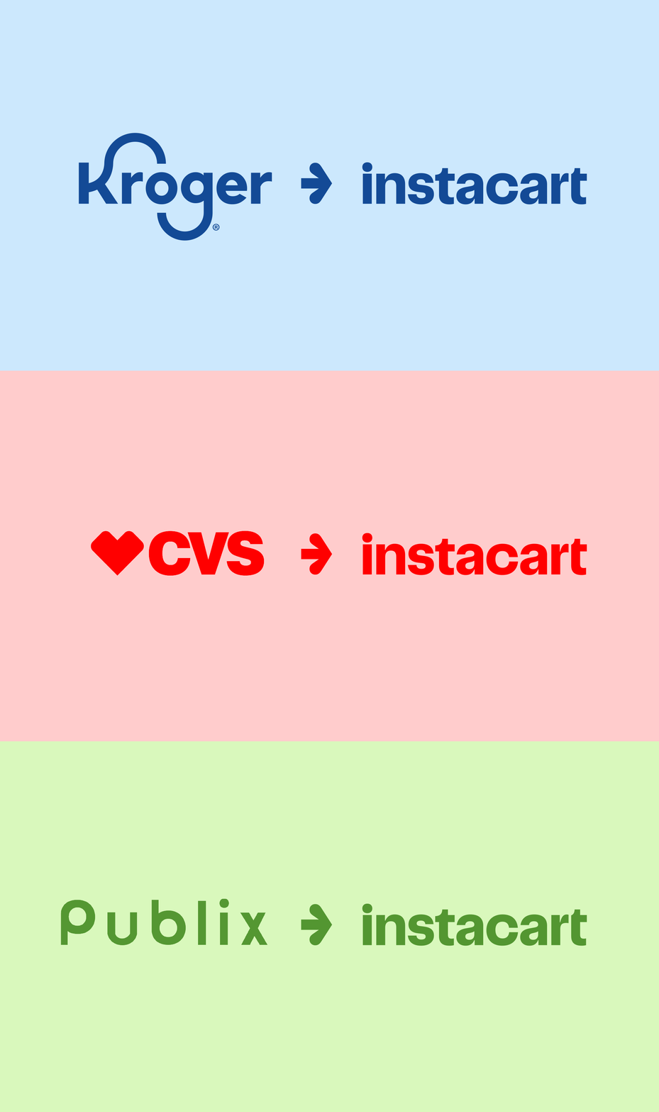
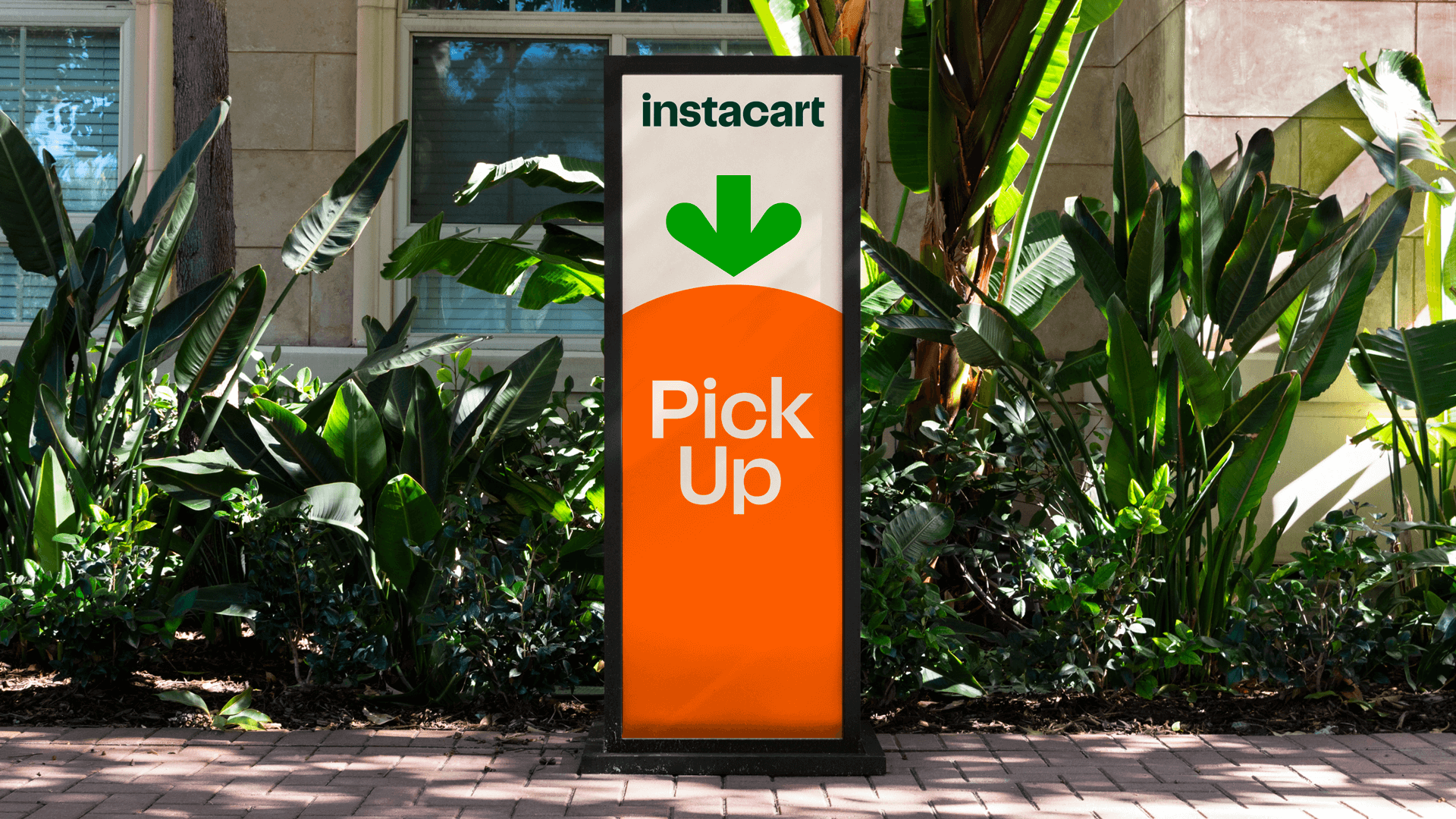

Over the coming weeks, you’ll see Instacart’s refreshed brand identity begin to come to life across all of our experiences. We’ll start with the consumer and shopper Instacart app, app stores, advertising offerings, retail and enterprise products, corporate website, email, social channels, paid media, and events assets.
Thank you to the teams and partners who gathered around our table to bring this work to life, from our agency partner Wolff Olins to our internal Creative Studio, Marketing and Design teams.
Our carrot has come a long way in the last 10 years, but it’s still growing — and we’re excited to see this latest version out in the world.
Most Recent in Company Updates

Company Updates
One Million Products Discovered and Delivered Through Free Gift Campaigns on Instacart
Connecting consumers with their new favorite brands with free product sampling We've hit an exciting milestone: over one million products delivered to consumers through our free gift advertising offering, designed to help people discover brands…
Feb 20, 2025
Company Updates
Classroom Carts: Supporting LA Schools Impacted by Wildfires
The recent wildfires in Los Angeles have had a devastating impact on the community – displacing families, closing schools, and forcing students and teachers to rely on remote learning. In the midst of the crisis…
Feb 19, 2025
Company Updates
Tackling Food Deserts in Columbia, SC: First Year Success and Program Expansion Plans
Many people across the country continue to face challenges accessing food because they live in food deserts – areas where affordable food options, including fresh fruits and vegetables, are hard to find. But we have…
Feb 3, 2025

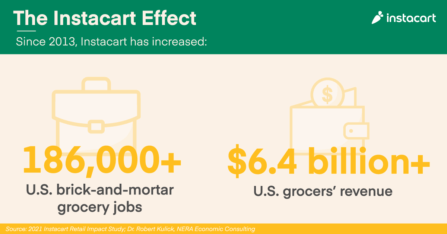 Instacart’s Impact on America’s Grocery Industry, by the Numbers
 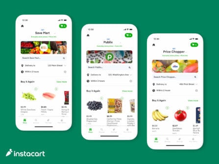 Breaking Down Barriers to Food Access with EBT SNAP Expansion
  Beyond the Cart: A Year of Essential Stories
  A Hot Take on America’s Favorite Hot Sauces 🌶
  JuJu Smith-Schuster: What’s in my Cart?
  Introducing the First-Ever Instacart Emerging Brand List
